


.jpg)

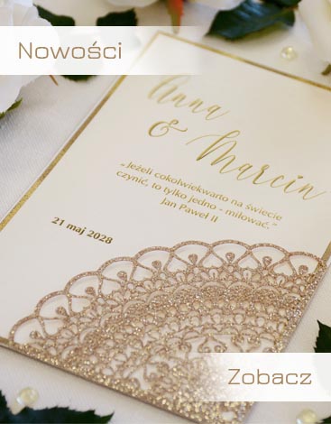
Przedstawiamy Wam, nowości zaproszeń ślubnych. Nasi projektanci stworzyli dla Was nową kolekcję, której główną cechą jest wyrafinowane wzornictwo i eleganckie wykonanie. Nasze produkty zostały po raz pierwszy zaprezentowane na wystawie w Niemczech TrauDich w Monachium, które wywołały duże zainteresowanie. Rozszerzyliśmy ofertę zaproszeń ślubnych wycinanych laserowo,w których widoczne są najmniejsze szczegóły. Wierzymy, że spodobają się i Wam.

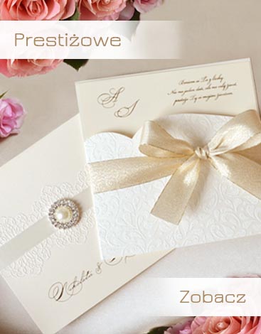
Jeżeli zamówisz zaproszenie na ślub z tej kategorii, bez wątpienia świadczy to o twoim dobrym guście. Zaproszenia ślubne wyglądają bardzo elegancko i luksusowo, choć ich cena jest bardzo korzystna. Posiadają wiele dodatków w postaci prawdziwych kryształów Swarovskiego, dekoracyjne wstążki, łuki oraz złote serca. Aby upewnić się, że ich jakość jest dla Państwa w pełni zadowalająca można zamówić bezpłatnie 3 darmowe wzory próbek. Wystarczy że, wypełnisz na naszej stronie formularz – darmowe próbki – a my niezwłocznie wyślemy je do Was.

Czy lubicie mieszać style? Przygotowaliśmy dla Was nową kolekcję zaproszeń ślubnych na rok 2018. Coraz więcej młodych par chce mieć swój pomysł na ślub, więc staraliśmy się stworzyć nowe projekty ślubne tak, aby każdy znalazł coś dla siebie. Jeżeli jesteś fanem łączenia stylów z różnych epok, podobają ci się nowoczesne motywy graficzne w połączeniu z tradycyjnymi dodatkami - styl vintage - to na pewno u nas znajdziesz coś co Cię zachwyci . Do każdego zaproszenia ślubnego stworzyliśmy cały zestaw, który pięknie uzupełni twoją dekorację ślubną w lokalu. W tym stylu wykonamy dla Ciebie zaproszenia ślubne, zawieszki na alkohol, menu, winietki z nazwiskami dla gości weselnych i niektóre rodzaje kopert.

Bardzo popularne kategoria, zaproszenia ślubne w Suer cenie. Jeśli zależy Wm na niskiej cenie zachecamy do obejżenia wzorów z tej kategori. W przeciwieństwie do zaproszeń z promocji ( które moga zostac w każdej chwili wyprzedane ) te wzory sa w regularnej sprzedaży.

Wymagania klientów są różne, ale najczęściej wybierają klasyczne eleganckie zaproszenie na ślub. Nie podlegająmodzie, wybierają zaproszenia według swojego upodobania. Przy wyborze zaproszeń warto wziąćpod uwagęzdanie rodziców, którzy na pewno chętnie doradzą najlepszy wybór zaproszenia. Eleganckie zaproszenie na ślub powinno zachwycić każdą z zapraszanych osób.

Stworzyliśmy specjalnie dla naszych Klientów serię zaproszeń inspirowanych folklorem góralskim.
Znajdziecie w tej kolekcji między innymi zaproszenia z nadrukiem tybetu zaczerpniętego ze spódnic, chust góralskich.Zaproszenia z parzenicą drewnianą, drukowaną bądź wykonaną nadrukiem błyszczącym. Nowością są zaproszenia z rozetką góralską drukowane na papierze ECO. Bardzo dużym powodzeniem cieszą się zaproszenia z powozem góralskim z koniami i parą góralską. Posiadamy także w swojej ofercie zaproszenia o wyglądzie gorsetu.

Jeśli lubisz nowoczesny i elegancki design i chcesz być na TOPIE z zaproszeniami ślubnymi, sądzimy że to właśnie w naszyj ofercie znajdziesz coś czym zachwycisz swoich gości.
Staramy się aby nasze starannie opracowywane wzorce, nadążały za ciągle zmieniającymi się trendami na rynku designerskim.

Wolicie zaproszenia na ślub, którę wywołują uśmiech na ustach adresata? W tej kategorii znajdziecie kolorowe i zabawne zaproszenia na wesele. Bardzo popularne są rysunki z kotem, biedronki lub wróblami. Bardzo popularne jest stosowanie metody drukowania termografii, który tworzy plastyczność motywem.

Wybierając zaproszenia ślubne, wiele z Was chciałoby mieć dodatki i dekoracje w jednym stylu. Dlatego stworzyliśmy nową kolekcję zaproszeń ślubnych, a wraz z nią dodatki dopasowane do tych zaproszeń. Każdy z gości z pewnością zwróci uwagę, gdy na stołach pojawią się dodatki, które nawiązują do wcześniej otrzymanych od Was zaproszeń. W jednym stylu, kolorze, bądź deseniu wykonamy dla Was zaproszenia ślubne, ślubne menu, zawieszki na alkohol lub naklejki, wizytówki imienne na stoły i wiele innych. Taki zestaw sprawi, że będzie panował porządek i harmonia na Waszym weselu. Goście bedą zachwyceni, a zarazem zdumieni, że przez kilka dodatków na Sali weselnej zrobi się stylowo i przejrzyście.

Dla każdego dziecka I Komunia Święta jest wielkim wydarzeniem. Dzieci w pięknych strojach czują się w tym dniu wyjątkowo. Dlatego na tak ważną uroczystość nie może zabraknąć zaproszenia komunijnego. Przedstawiamy Państwu eleganckie zaproszenia komunijne w kolorze białym lub kremowym z motywami kwiatów lub ornamentami kwiatowymi. Wszystkie zaproszenia komunijne możemy przygotować z nadrukiem wg życzeń Klienta. Zapraszamy do zapoznania się z ofertą!Wyjątkowe zaproszenia komunijne, ręcznie zdobione w kolorze bieli i ecri.

Jako jedna z nielicznych firm na rynku posiadamy w swojej ofercie koperty w wielu nietypowych rozmiarach. Kolorystyka naszych kopert to biel i ecri.
Koperty można zamawiać razem z zaproszeniami lub osobno.

W naszej szerokiej ofercie posiadamy również winiety z imionami gości. Jest to w ostatnich latach popularny sposób usadawiania ludzi, pozwalający młodym zachować lepsza organizację na weselu.
Zachęcamy do wyboru naszych wzorów.

Elegancka forma, która pozwoli na zapoznanie się gościa z daniami serwowanymi na weselu. Każdy projekt przygotowywany jest na specjalne zamówienie, z dbałością o nadobniejsze detale.

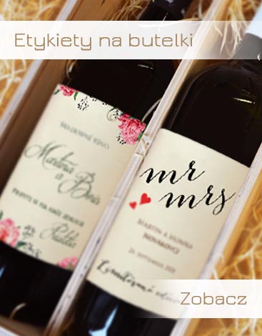
Ciekawy sposób, aby przypomnieć swoim bliskim o tym pięknym dniu w Waszym życiu. Zachęcamy do obejrzenia oryginalnych nadruków na butelkach. Każdy projekt przygotowywany jest na indywidualne zamówienie.

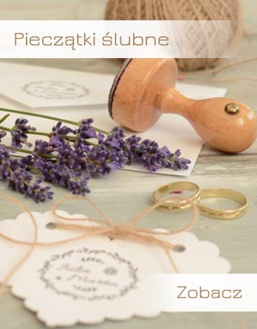
Pieczątka ślubna jest idealnym pomocnikiem w przygotowaniu dodatków weselnych. Do czego można ją użyć? Masz gotowe serwetki ślubne i chcesz je ulepszyć? To nie problem. Wystarczy pieczątka. Możesz upiększyć swoje serwetki weselne łatwo i szybko swoimi imionami! Przygotowujesz upominki dla gości i masz tylko zwykłe pudełka? Ozdób je pieczątkami, dzięki nim uzyskają indywidualny wygląd. Na pieczątce ślubnej możesz podać swoje imię i nazwisko, datę lub miejsce ślubu. Tworzysz własne akcesoria, które są wyjątkowe i niepowtarzalne.

Fotoksiążka jest doskonałym prezentem dla rodziny, znajomych, a także dla nas samych. Tradycyjne albumy fotograficzne są już niepraktycze, a zdjęcia przeglądane na komputerze nie wywołują w nas emocji. W przypadku przeglądania fotoksiążki, wyzwalają się silne emocje, wspomnienia, a czasem nawet łzy. Fotoksiążka to idealny prezent na urodziny, komunię, wesele lub inną uroczystość. Pełną ofertę dotyczącą fotoksiążek można znaleźć pod adresem www.pamas-fotoksiazka.pl

Firma Pamas jest jednym z największych producentów kartek świątecznych. Działamy na terenach kliku państw UE.
Jeżeli chcecie podziękować swoim partnerom biznesowym, klientom lub pracownikom za współpracę, zapraszamy do zapoznania się z naszą ofertą biznesowych kartek świątecznych.
Całą ofertę znajdziecie pod adresem: www.kartkaswiateczna.pl

Copyright © 2008 - 2026 Pamas. Wszelkie prawa zastrzeżone.